


Let's start with a few numbers. According to Gallup, about 70% of consumer decisions are driven by emotion. Greenbook's research goes further: 86% of purchase decisions are shaped by an average of 10 emotional needs. This isn't a marketing slogan — it's a pattern that keeps showing up in the data.
The payoff for brands is just as clear. Nielsen's 2026 Global Advertising Effectiveness Report looked at more than 500 CPG campaigns across North America and Europe. Campaigns with the strongest emotional resonance saw a 27.4% sales lift within 90 days of launch, compared to just 5.2% for the weakest ones. McKinsey's 2026 survey of 310 CMOs found something similar: brands investing the most in emotional marketing grew new customer acquisition by 44.6% year over year — almost four times faster than the brands that invested the least.
Here's the part packaging companies should pay attention to: this pattern holds true in B2B too. Emotional connection accounts for 66% of B2B buying decisions. So even when your customer is a procurement manager or a brand director rather than a shopper, "this packaging makes me feel something" still matters when it comes time to place an order.
That's exactly why we pay close attention to emotional value in design. It isn't an East Asian trend. It's a shift happening across the whole packaging industry.
Dieline Awards 2026: A Global Vote for Emotion
This past May, The Dieline Awards 2026 — one of the largest packaging design competitions in the world — was announced at LUXE PACK New York. The competition received more than 1,500 entries from over 90 countries. The judging panel included well-known names like Wedge co-founder Sarah Di Domenico and Established co-founder Sam O'Donahue, and every entry was scored on creativity, marketability, innovation, execution, and on-pack branding.
One signal stood out in the post-awards coverage from industry outlet PACKNODE: plastic-free materials, recyclable structures, and emotional storytelling were the common thread running through this year's winners. In other words, sustainability and emotional design aren't competing priorities anymore — they're two sides of the same winning formula.
The seven cases below are all real 2026 Dieline Awards winners, spanning Germany, the US and Canada, Brazil, Greece, and New Zealand — and covering categories we know well: spirits and gift boxes, beauty and personal care, beverages, sauces and condiments, jewelry packaging, and hair care.
Varus 775: How a Gin Brand Won Best of Show With an "Unboxing Ritual"
Brand: Varus 775 | Design: OlssønBarbieri | 2026 Dieline Awards Best of Show
Varus 775 is the first spirits brand to take home Dieline's top prize since 2019. The story behind it goes back to 9 AD and the Battle of the Teutoburg Forest — the battle that stopped Roman expansion into Germany, fought just outside this family-owned distillery.
The packaging is a three-part system: a glass bottle, a lightweight aluminum refill, and the real star — a porcelain vessel inspired by ancient Roman containers. Lifting that vessel out of its wooden crate is designed to feel like a small ceremony, echoing the brand's core idea that drinking should be a ritual. The visual details go just as deep: illustrations of the surrounding forest, a regional coat of arms, Roman-style lettering on the logo, and even a custom coin featuring two clasped hands.


Cocolab: Turning Oral Care Into "A Daily Hit of Dopamine"
Brand: Cocolab (formerly Cocofloss) | Design: Wedge | 2026 Dieline Awards Rebrand of the Year + Studio of the Year
Cocofloss built a cult following on the idea that "floss can be cute too." As the brand grew into a full oral-care line, it turned to design studio Wedge for a rebrand built around one simple idea: "Your Daily Hit of Dental Dopamine." Oral care was reframed as beauty care — in Wedge's own words, "a system worthy of the MoMA store."
Bold, contrasting colors paired with rounded type and generous white space make the whole line pop like candy on a shelf, without looking cheap. This kind of work is part of why Wedge took home Studio of the Year for the third year running — proof that color-driven emotional design is still one of the hardest things to get right, and one of the most rewarding when it works.


PAZ: An Energy Drink About "Peace" That Cuts Through a Noisy Shelf
Brand: PAZ | Design: HardCuore | 2026 Dieline Awards Best of Beverage + Best of Functional Beverage
Paz means "peace" in Portuguese, but this energy drink isn't selling calm — it's selling clear, steady, controlled focus. Energy drink shelves are usually a wall of visual noise: neon colors, lightning bolts, skulls. Brazilian studio HardCuore went the other way, drawing on 1980s running aesthetics, retro Olympic colors, and the restrained typography of an old-school car brand.
On a shelf full of drinks shouting for attention, one drink talking about peace is the one people actually notice. That's contrast working as an emotional strategy.


yiayia and friends: A Greek Grandmother and Her Circle of Friends
Brand: yiayia and friends | Design: Beetroot | 2026 Dieline Awards 1st Place, Sauces, Oils & Spices
Instead of the usual "organic = green leaves" shortcut, the design team gave every flavor its own character: a grandmother in a crescent-moon headscarf, an elephant hugging a teapot, a wide-eyed lavender sprite. Every character has an expression, a personality, and a sense of "something happening" — the packaging stops being a container for information and becomes a small illustrated postcard you take home.


✨ Looking for a manufacturing partner who can turn this kind of thinking into real, produced packaging? Take a look at our great packaging design case studies to see what's possible. ✨
Monica Rich Kosann: Turning Jewelry Packaging Into "A Second Gift"
Brand: Monica Rich Kosann | Design: Here Design | 2026 Dieline Awards 1st Place, Clothing, Fashion & Fragrance
Jewelry packaging has a classic problem: the product inside is already precious, so packaging that tries too hard feels like overkill, while packaging that's too plain doesn't match the emotional weight of what's inside. Here Design's solution was to treat the unboxing itself as its own emotional moment — judges described the result as packaging that turns into a gift you can open twice.


Daise: Using Gradients and Flower Shapes to Win Over Gen Z
Brand: Daise | Design: Zuru Edge | 2026 Dieline Awards 1st Place, Beauty & Cosmetics
Daise comes from New Zealand entrepreneur Jaimee Lupton, founder of Monday Haircare, and it's built for one audience: Gen Z. Flat, flower-shaped bottles, soft gradient colors, and a foaming body wash container that looks like a can of whipped cream — every detail says "this is your little moment of joy." It's a strong example of colorful packaging that still feels premium rather than childish.
The emotional value here is self-care: buying a body lotion is also buying the feeling that "I deserve to be treated gently today."


Isima: How Shakira's Hair Care Brand Broke the Celebrity Brand Mold
Brand: Isima | Design: Established | 2026 Dieline Awards 1st Place (Gold), Body Care
Celebrity brands usually play it safe — packaging that's tasteful, restrained, and predictable, so it feels worthy of the celebrity's name. The result often ends up looking like it could belong to anyone. Shakira's hair care brand Isima did the opposite. Dieline described it as "joyful maximalism," matching the brand's own philosophy: "más es más" — more is more.
The line uses multiple custom bottle colors paired with contrasting white type, rounded-off pump details, and a matte overspray finish to keep color matching consistent across components. The brand was built to serve textured, multi-type hair — a group long overlooked by mainstream Western beauty — and the bold, expressive packaging matches that message: not a polished persona, but a celebration of hair as it actually is.


Three Transferable Design Lessons
Looking at all seven cases together, three patterns hold up across markets:
yiayia's grandmother, Varus 775's Roman battle, Isima's "más es más" — each gives the product a story in motion, or a clear point of view, instead of a line of functional copy. The story doesn't need to be complicated, but it needs a specific, memorable hook.
Cocolab uses bold color for a dopamine hit, PAZ uses retro sports colors for restrained attitude, Daise uses low-saturation gradients for youthful self-care, Isima uses multiple bold colors for authentic self-expression. The intensity can go in opposite directions, but the process is the same: decide what you want people to feel in three seconds, then use white space or tight color control to dial that feeling to the right strength — instead of copying competitors or stacking on trends.
Varus 775's three-part ritual and Monica Rich Kosann's "second gift" experience aren't things graphics alone can deliver — they come from structural engineering, insert design, and how the box opens. This is exactly where a factory with both design and production capability has the advantage: emotional design that only exists as a rendering usually falls apart once it hits the sampling stage and the structure can't carry the story.
Three Takeaways for Manufacturers
PACKNODE's wrap-up of the 2026 winners was clear: plastic-free materials, recyclable structures, and emotional storytelling ran through this year's award list together. That means when we recommend FSC-certified paper or biodegradable molded pulp to a customer, we don't need to separate "eco-friendly" from "likeable" — they're two sides of the same reason people buy. Colourful packaging doesn't have to mean less sustainable, and this year's winners proved it.
In at least half of the seven cases above, the emotional payoff comes from structure itself — the unboxing motion, the feel of an insert, a refill mechanism — not from printed artwork. That's why structural engineers should be talking to a client's brand team early, rather than reviewing feasibility only after the artwork is finalized.
The Dieline Awards judging panel is made up of leading design studios from around the world, scoring on creativity, marketability, and execution together. That's exactly why award-winning cases are worth studying on the manufacturing side — designs that pass professional review have usually already been proven feasible at scale, which is a more reliable reference than chasing whatever is trending on social media this week.
Action Checklist for Brands
If you're planning your next packaging refresh with emotional value in mind, here are 5 steps to start with:
Reference yiayia's grandmother: if your brand were a character, what expression would it have? Sketch it first, before you even think about color.
Reference Cocolab and Daise: write down 3 keywords for how you want people to feel, pick one main color for each, and keep at least 30% of the layout as white space.
Reference Varus 775: what's the first thing a customer does after receiving your packaging — open it, lift something out, flip it over? That motion is part of the emotional design and should be confirmed with a structural engineer during sampling, not left until the end.
Don't write "100% biodegradable." Try "You deserve to be treated gently today" (like Daise) or "More is more — be your real self" (like Isima). Read it out loud to 3 target customers and see whether they nod or shrug.
Make 2–3 different directions as first samples, run them past target customers for an emotional reaction test (what's their first thought? would they buy it?), then refine the direction that tests best. It costs less than committing to one design upfront and reworking it later.
✨ Want Colorful, Eco-Friendly Packaging Like This?
We Already Make It. 😉
Every case above makes the same point: character and color sell, and sustainability doesn't have to get in the way of either. That happens to be exactly what we do at Otarapack.
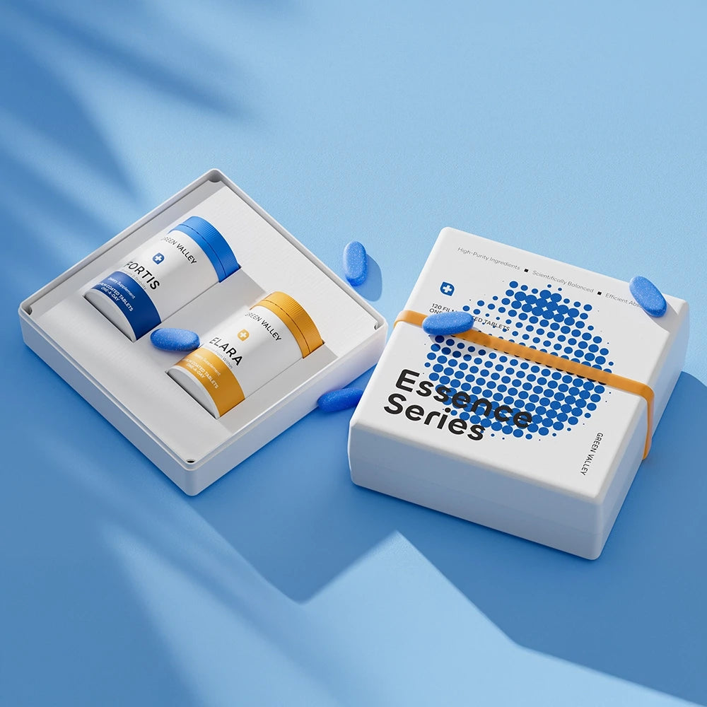
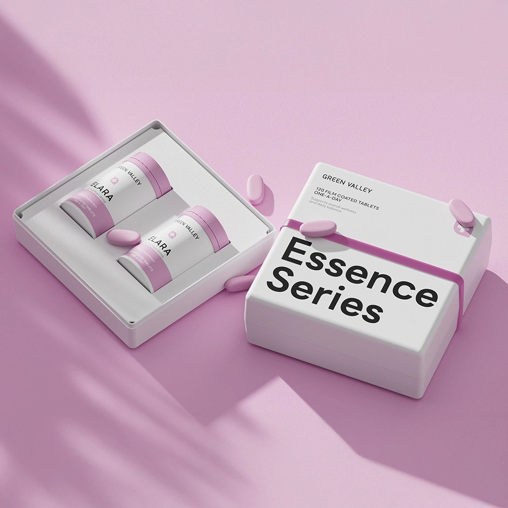
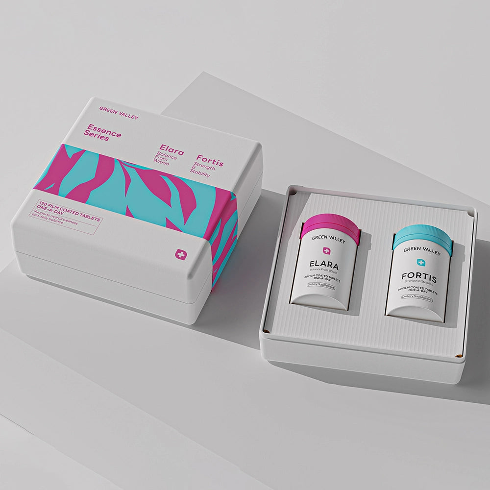
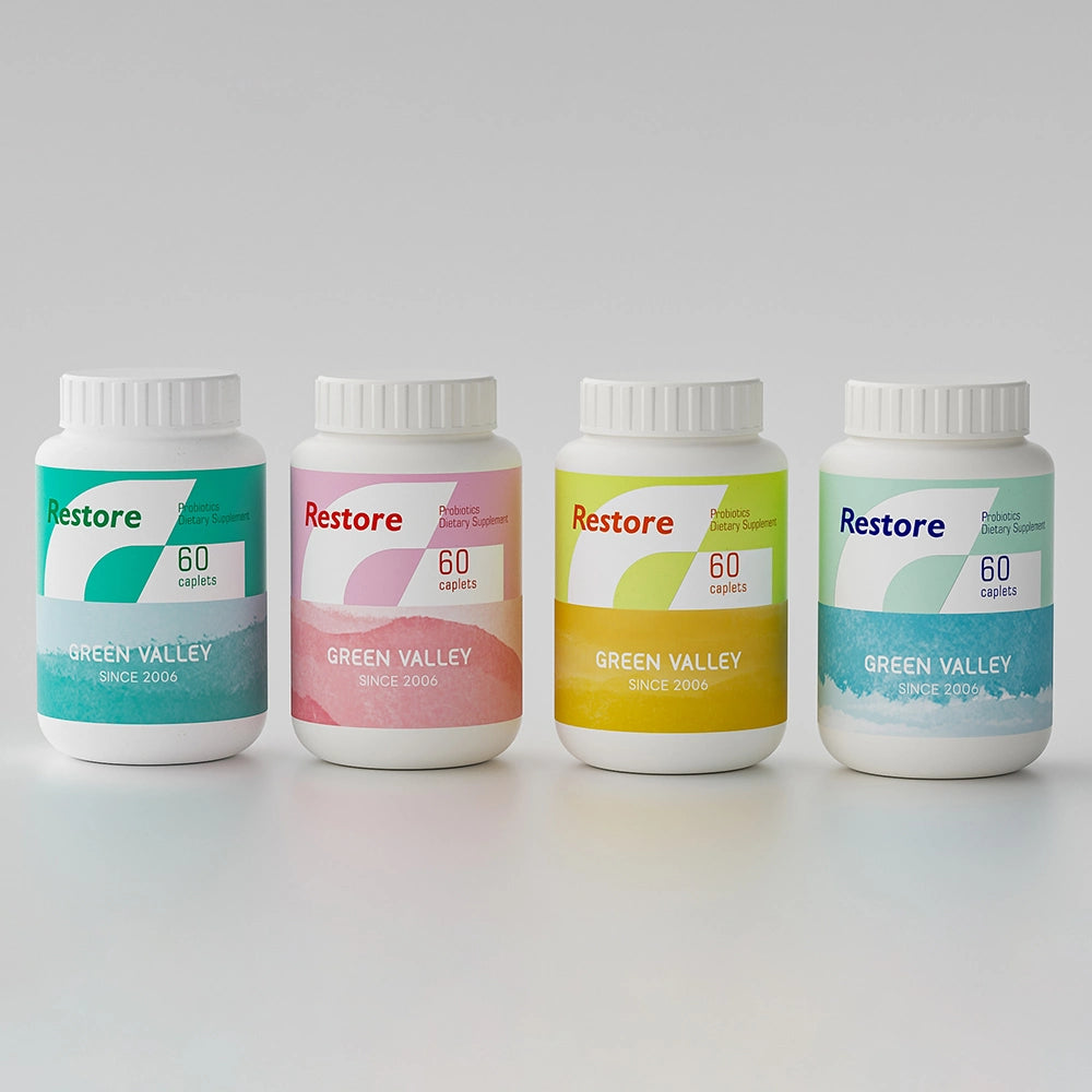
Our molded pulp packaging is made from plant fiber — fully biodegradable and recyclable — and it doesn't have to look plain or "eco-beige" to earn that reputation. We already produce playful patterns, gradients, and bold two-tone combinations for supplement and wellness brands, the same categories where Cocolab and Daise won this year. It's proof that colourful packaging and eco materials aren't opposites — they can be the same box.
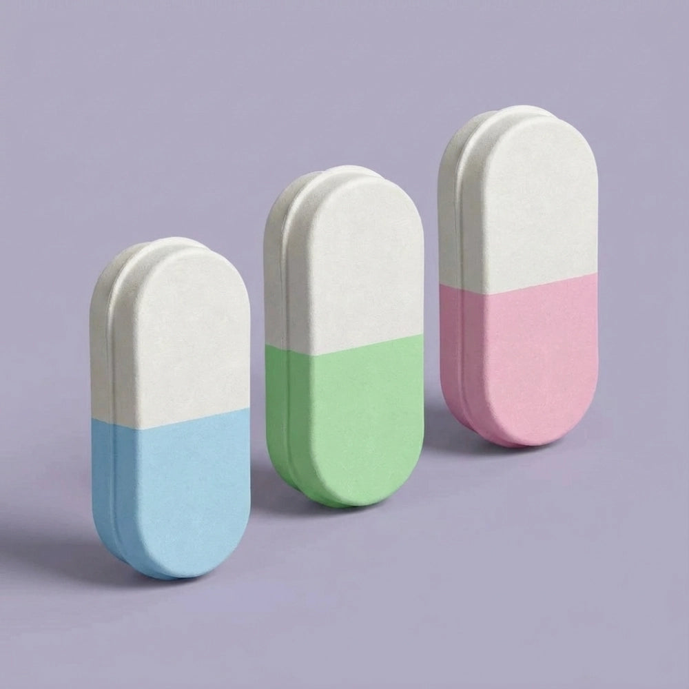
If you're a brand looking to combine sustainability with a design that actually stands out on a shelf, take a look at our stock-mold supplement packaging collection — fruit patterns, polka dots, gradient lids, and capsule-shaped designs are ready to customize with your own branding. Browse our colorful packaging collection to see what's already in production.


Case data in this article comes from the official 2026 Dieline Awards winners list (thedieline.com) and public industry reports from PACKNODE, Nielsen, McKinsey, Gallup, Greenbook, Euromonitor, and Innova Market Insights, published or updated in 2026.


